Build a paginated list in React with SWR and Styled Components

In a previous blog post, we have learned how to build an API with pagination. In this blog post, we are focusing on how to consume such an API by building a paginated list using React, the most popular javascript frontend framework at the moment.
Project setup
To generate the project, we use the popular toolchain Create React App :
npx create-react-app build-paginated-list-in-react
Once the project is created, we install the required dependencies using npm :
npm i swr axios styled-components
Axios is a popular HTTP client we use to consume the API and get our paginated data. It is a substitute to the fetch API provided by default in most browsers. It is easy to use and provides useful features out of the box such as automatic JSON transformation or HTTP interceptors.
SWR is a data fetching library created by Vercel, the company behind Next.js. It provides a custom React hook with a whole lot of features and built-in optimization, and is very well documented on top of that https://swr.vercel.app/.
Styled Components is the most used CSS-in-JS styling library. CSS-in-JS is a styling technique where the styles are written in javascript, and then parsed to generate the CSS. If CSS-in-JS is not to your liking, there are many other ways to style components in React such as utility libraries like Tailwind, CSS modules, or even vanilla CSS.
For the purpose of this blog, we are using mockAPI as the backend layer https://mockapi.io/docs.
We keep things simple by declaring a single entity and by using the default setup :
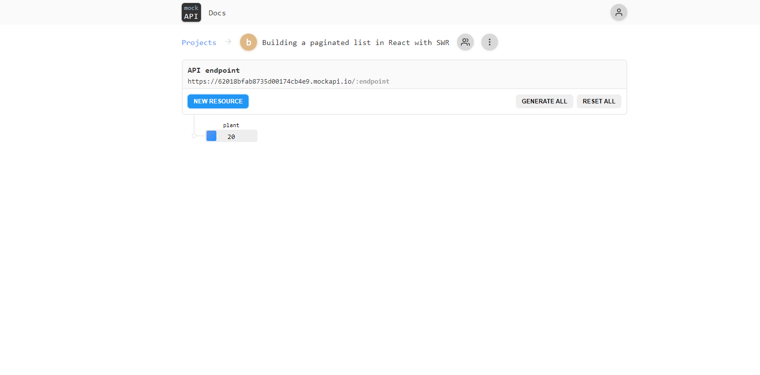
The only modification is to define the JSON template of the response for the root endpoint :
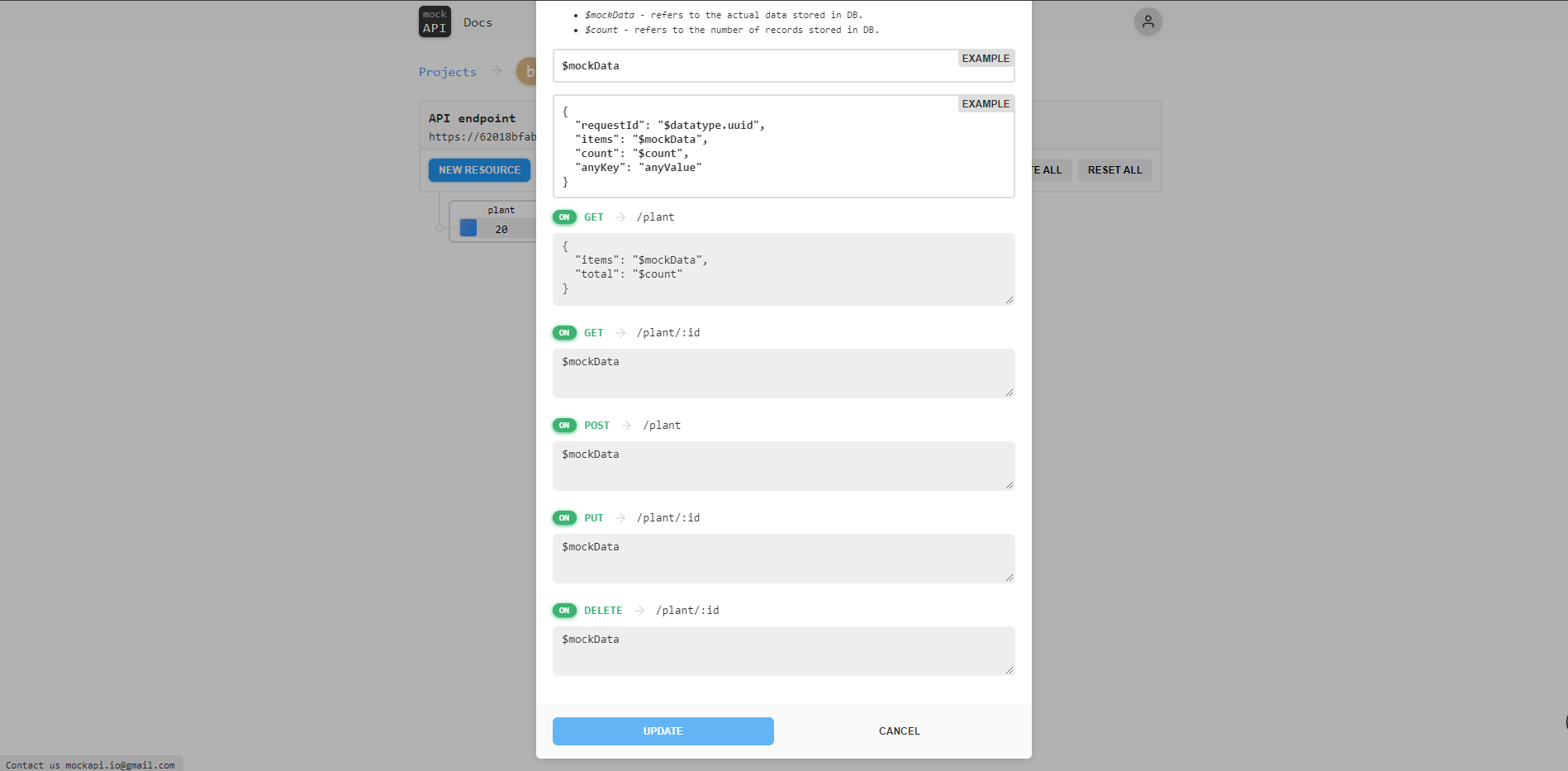
We add the total number of elements available which will be of use when building the pagination mechanism.
Building the base
Let’s start by building the basic elements of our application.
The first step is to declare global styles used all across the application :
:root {
  --color-primary: rgb(123, 168, 119);
  --color-primary-light: rgb(214, 244, 207);
  --color-primary-dark: rgb(71, 92, 68);
  --color-primary-disabled: rgb(103, 112, 99);
  --color-secondary: rgb(148, 134, 107);
  --color-background: rgb(255, 255, 255);

  background-color: var(--color-background);
  color: var(--color-primary-dark);
}

body {
  margin: 0;
  font-family:
    -apple-system, BlinkMacSystemFont, 'Segoe UI', 'Roboto', 'Oxygen', 'Ubuntu',
    'Cantarell', 'Fira Sans', 'Droid Sans', 'Helvetica Neue', sans-serif;
  -webkit-font-smoothing: antialiased;
  -moz-osx-font-smoothing: grayscale;
}
Aside from fonts, the purpose of this file is to declare the colors used in our application. We use CSS custom properties for that purpose so that if one color needs a slight adjustment, it will be applied everywhere, without the need to modify the color in every single place it is used.
We also edit the default App.js component :
import styled from 'styled-components';
import PaginatedList from './Components/PaginatedList';

const Container = styled.div`
  display: flex;
  flex-direction: column;
  align-items: center,
  marginTop: 2rem,
  > * {
    margin-right: 0.8rem;
  }
`;

const Header = styled.header`
  padding: 2rem 0 2rem 2rem;
  background: var(--color-primary);
  color: white;
`;

const Title = styled.h2`
  margin: 0;
`;

const App = () => {
  return (
    <Container>
      <Header>
        <Title>Paginated List in React with SWR</Title>
      </Header>
      <main>
        <PaginatedList />
      </main>
    </Container>
  );
};

export default App;
We keep the layout simple, with only a basic header containing a title and the PaginatedList component.
As stated before, we make use of styled component to declare our style directly in the component. In this manner, we keep the styles close to where they are used, and it makes the JSX clear and concise.
Building the components
We can now build the components using a top-down approach, by implementing the components as we need them.
Let’s start by creating the main component which is the PaginatedList component :
import useSWR from 'swr';
import axios from 'axios';
import styled from 'styled-components';
import { useState } from 'react';
import Plant from './Plant';
import Pagination from './Pagination';
import SortButton from './SortButton';

const fetcher = async (url) => {
  const res = await axios.get(url);
  return res.data;
};

const Container = styled.div`
  display: flex;
  flex-direction: column;
  align-items: center;
  margin-top: 2rem;
`;

const PlantContainer = styled.div`
  display: flex;
  flex-direction: column;
  align-items: center;
  margin-bottom: 2rem;
`;

const PaginatedList = () => {
  const [page, setPage] = useState(1);
  const [sortBy, setSortBy] = useState('name');
  const [order, setOrder] = useState('desc');
  const limit = 5;

  const { data, error } = useSWR(
    `${process.env.REACT_APP_API_URL}/plant?page=${page}&limit=${limit}&sortBy=${sortBy}&order=${order}`,
    fetcher,
  );

  if (!data || !data.items) {
    return null;
  }

  return (
    <Container>
      <SortButton order={order} setOrder={setOrder} />
      <PlantContainer>
        {data.items.map((plant) => (
          <Plant plant={plant} key={plant.name} />
        ))}
      </PlantContainer>
      <Pagination
        page={page}
        setPage={setPage}
        limit={limit}
        total={data.total}
      />
    </Container>
  );
};

export default PaginatedList;
We keep track of the state of the pagination and sorting using useState hooks. The state and their setter functions are passed to the components that need them through props, but we could use a Context or even a global state management library if we would want our application to grow in complexity, and avoid bad practices like props drilling.
We fetch the data from MockAPI using the useSWR hook. This hook takes a key and a fetcher function that is given the key as an argument. In our case, the key is simply the complete URL of the endpoint to fetch our data from, and the fetcher function a simple fetch to the provided URL, which is done using Axios ... and that’s it!
The useSwr also returns an error object, which is defined only if the promise from the fetch has been rejected. We don’t handle it here, but we could return a different component when the error is defined.
Using fetching library such as SWR is great because, on top of providing a very straightforward API, It also provides handy features that improve performance and user experience out of the box such as automatic revalidation, error handling, caching, and much more. You can check the official documentation to learn more about it https://swr.vercel.app/docs/getting-started.
Once the data is fetching from MockAPI, we map each fetched plant to a Plant component :
import styled from 'styled-components';

const Container = styled.div`
  display: flex;
  align-items: center;
  border: 3px solid var(--color-secondary);
  border-radius: 15px;
  padding: 0.6rem;
  margin-top: 2rem;
  > * {
    margin-right: 0.8rem;
  }
`;

const Key = styled.label``;

const Value = styled.label`
  margin-left: 0.5rem;
  font-weight: 700;
`;

const Plant = ({ plant }) => {
  return (
    <Container>
      {Object.entries(plant).map(([key, value]) => {
        return (
          <div>
            <Key>{`${key} :`}</Key>
            <Value>{`${value}`}</Value>
          </div>
        );
      })}
    </Container>
  );
};

export default Plant;
We loop on each property of the plant to display each value alongside its key. We again make use of styled component and flexbox for the styling of the component.
As you may have noticed, the fetched data is sorted thanks to the sortBy and order query string parameters in the URL. In our simple demo application, the field by which to sort by is hardcoded, but we could create a component to let the user set it dynamically.
To control the order of the list, we define a SortButton component :
import styled from 'styled-components';
import sortasc from '../images/sortasc.svg';
import sortdesc from '../images/sortdesc.svg';

const Button = styled.div`
  border-radius: 15px;
  padding: 0.6rem;
  cursor: pointer;
  background-color: var(--color-primary);
  transition: background-color 0.3s;
  &:hover {
    background-color: var(--color-primary-dark);
  }
  &:active {
    background-color: var(--color-primary-light);
  }
`;

const Image = styled.img`
  width: 1.5rem;
  filter: invert(100%) sepia(0%) saturate(7500%) hue-rotate(175deg)
    brightness(121%) contrast(114%);
`;

const SortButton = ({ order, setOrder }) => {
  return (
    <Button
      onClick={() =>
        setOrder((previousOrder) => (previousOrder === 'desc' ? 'asc' : 'desc'))
      }
    >
      <Image src={order === 'desc' ? sortdesc : sortasc} alt="sort icon" />
    </Button>
  );
};

export default SortButton;
The state for the order and its setter are passed as props directly to the component.
The order toggles between descending and ascending order each time the button is pressed. The component then re-renders to update the image to show the new order applied to the list.
Let’s now checkout the Pagination component, which control everything pagination related :
import styled from 'styled-components';
import chevronLeft from '../images/chevron-left.svg';
import chevronsLeft from '../images/chevrons-left.svg';
import chevronRight from '../images/chevron-right.svg';
import chevronsRight from '../images/chevrons-right.svg';

const PaginationContainer = styled.div`
  display: flex;
  align-items: center;
  > * {
    margin-right: 0.8rem;
  }
`;

const PaginationButton = styled.button`
  display: flex;
  align-items: center;
  outline: none;
  border: none;
  border-radius: 50px;
  img {
    filter: invert(100%) sepia(0%) saturate(7500%) hue-rotate(175deg)
      brightness(121%) contrast(114%);
  }
  ${(props) => (props.disabled ? disabled : enabled)};
`;

const enabled = `
cursor: pointer;
background-color: var(--color-primary);
transition: background-color 0.2s;

&:hover {
  background-color: var(--color-primary-dark);
}

&:active {
  background-color: var(--color-primary-light);
}
`;

const disabled = `
  background-color: var(--color-primary-disabled);
`;

const PaginationLabel = styled.label`
  font-size: 1rem;
`;

const Pagination = ({ page, setPage, total, limit }) => {
  const goToFirstPage = () => setPage(1);

  const goToLastPage = () => setPage(getLastPage());

  const incrementPage = () => page < getLastPage() && setPage(page + 1);

  const decrementPage = () => page > 1 && setPage(page - 1);

  const atFirstPage = () => page === 1;

  const atLastPage = () => page === getLastPage();

  const getLastPage = () => Math.ceil(total / limit);

  return (
    <PaginationContainer>
      <PaginationButton
        onClick={() => goToFirstPage()}
        disabled={atFirstPage()}
      >
        <img src={chevronsLeft} alt="go to first page icon" />
      </PaginationButton>
      <PaginationButton
        onClick={() => decrementPage()}
        disabled={atFirstPage()}
      >
        <img src={chevronLeft} alt="go to previous page icon" />
      </PaginationButton>
      <PaginationLabel>{page}</PaginationLabel>
      <PaginationButton onClick={incrementPage} disabled={atLastPage()}>
        <img src={chevronRight} alt="go to next page icon" />
      </PaginationButton>
      <PaginationButton onClick={goToLastPage} disabled={atLastPage()}>
        <img src={chevronsRight} alt="go to last page icon" />
      </PaginationButton>
    </PaginationContainer>
  );
};

export default Pagination;
All required states, setup, and parameters are passed as props, in a similar way to previous components.
We create buttons to do the following actions :
- go to the first page
- go to the previous page
- go to the next page
- go to the last page
We make use of the total number of elements that we have added to the template returned by MockAPI to know when the last page is reached.
We also make use of styled component props to have a base styling for all buttons and change only the colors and the cursor depending on whether the button is disabled or not.
Putting it all together
Now that everything is setup we can start our project :
npm run start
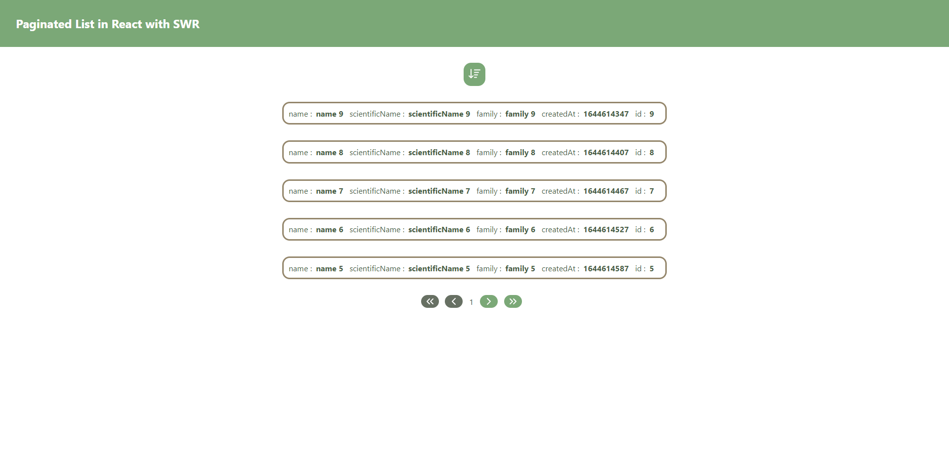
And here is the final result !
The project for this blog is available here https://github.com/Mozenn/pagination-in-react-with-useSwr.